A Better Bus Map: How Good Transit Map Design Can Strengthen Boston’s Bus System
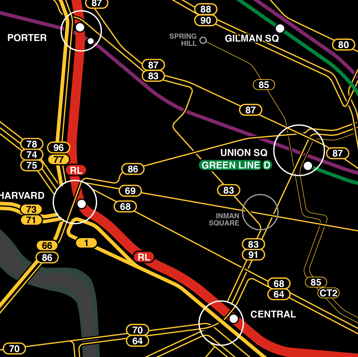
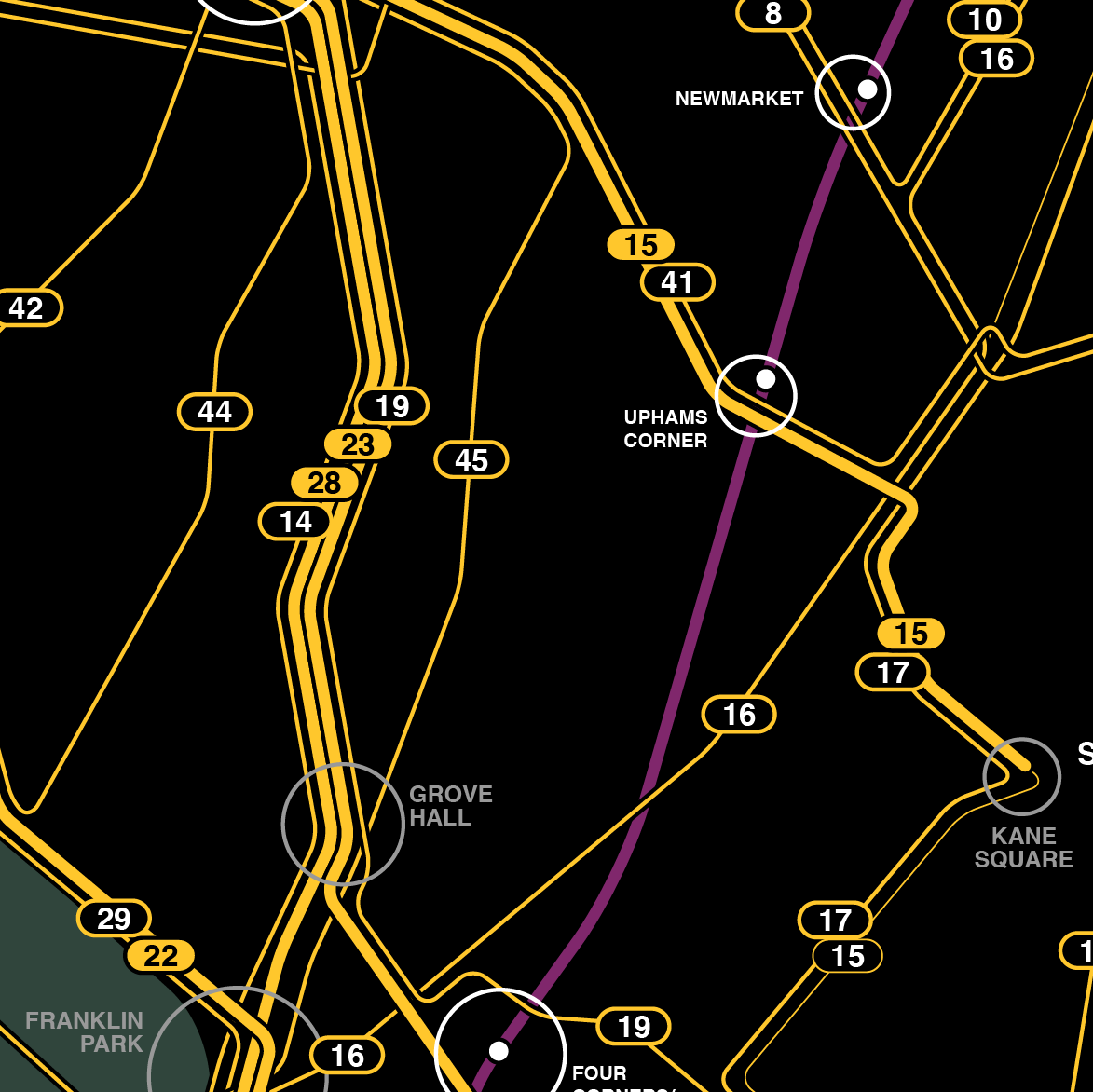
Proposed MBTA System Map Style
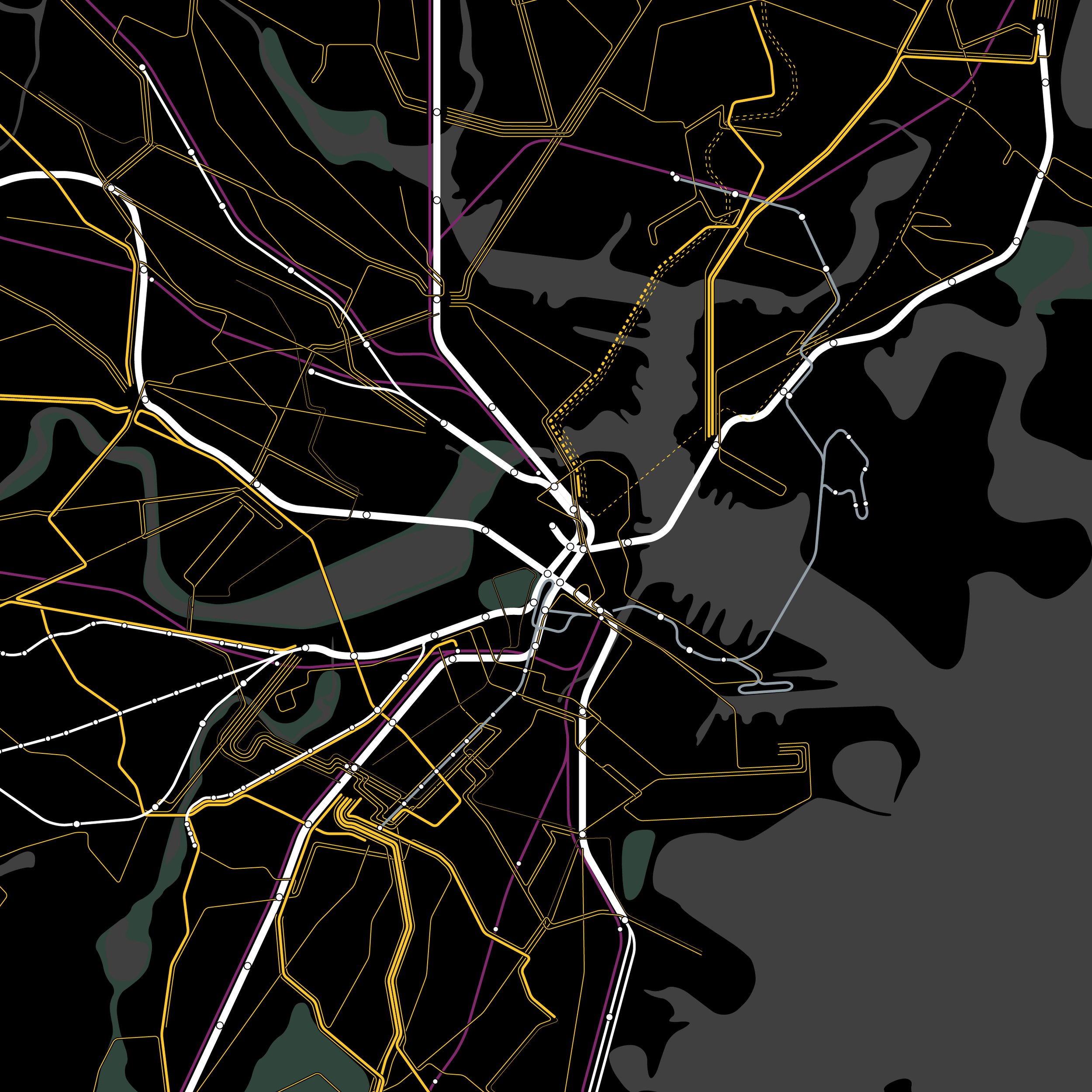
Current MBTA System Map Style
Greater Boston, MA
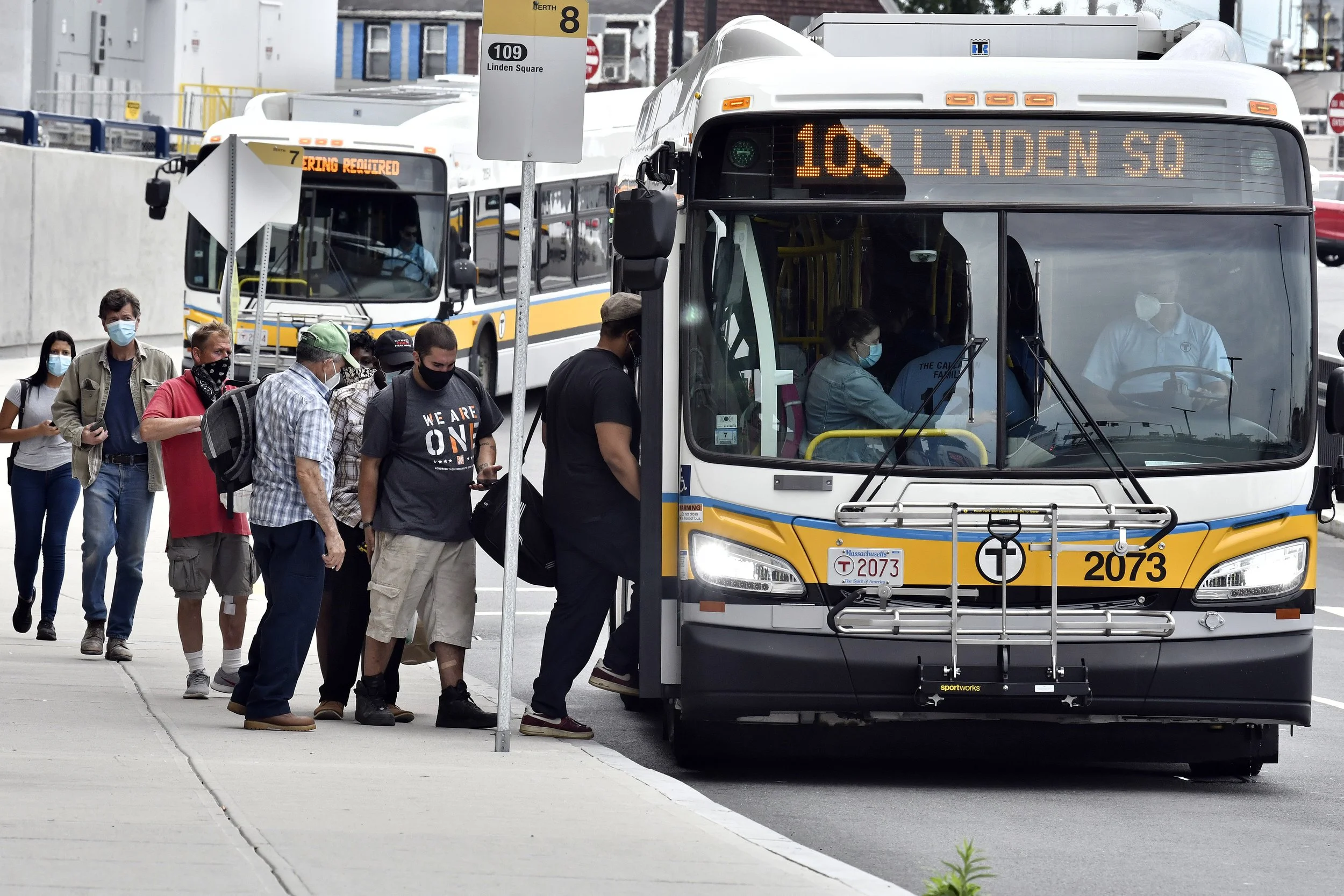
Greater Boston is poised to radically reimagine its bus system in the coming years. With an ongoing network redesign by the Massachusetts Bay Transportation Authority (MBTA) seeking to create a dense network of high frequency bus lines as well as growing political momentum for fare-free transit spearheaded by Mayor of Boston Michelle Wu, the current moment is an exciting one for the future of sustainable, equitable mobility. Improvements to the bus system have the potential to attract more riders, decrease transportation-related carbon emissions, and increase access to opportunities for marginalized communities.
Despite ongoing service improvements, there has been little discussion of visual improvements to the bus system. How
will riders perceive and discover a redesigned network? How can historic improvements in bus service be bolstered by systemwide visual cues? A key gap in the MBTA’s otherwise strong brand identity represented by color-named transit lines lies in its printed bus system maps available at bus shelters and online. Visually unifying the transit system is a crucial part of maximizing the benefits of these changes in service.
This thesis explores bus map redesign precedents, historical MBTA maps, and transit mapping techniques to reconsider
what the MBTA bus system map could be. Guided by two main principles of consistency with the MBTA’s brand and highlighting service frequency, this thesis iterates through different options to arrive at a draft proposal of a new bus map that reframes how the transit system—and broader region—can be depicted and perceived.
Detail

Research

Current Map At Bus Stop

Current Map Detail
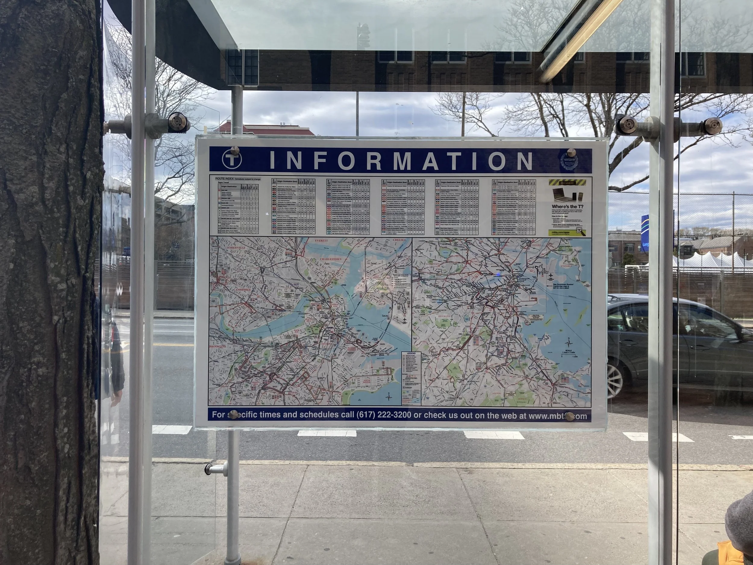
Current Map Variation

New Line-Specific Maps


Map Tests


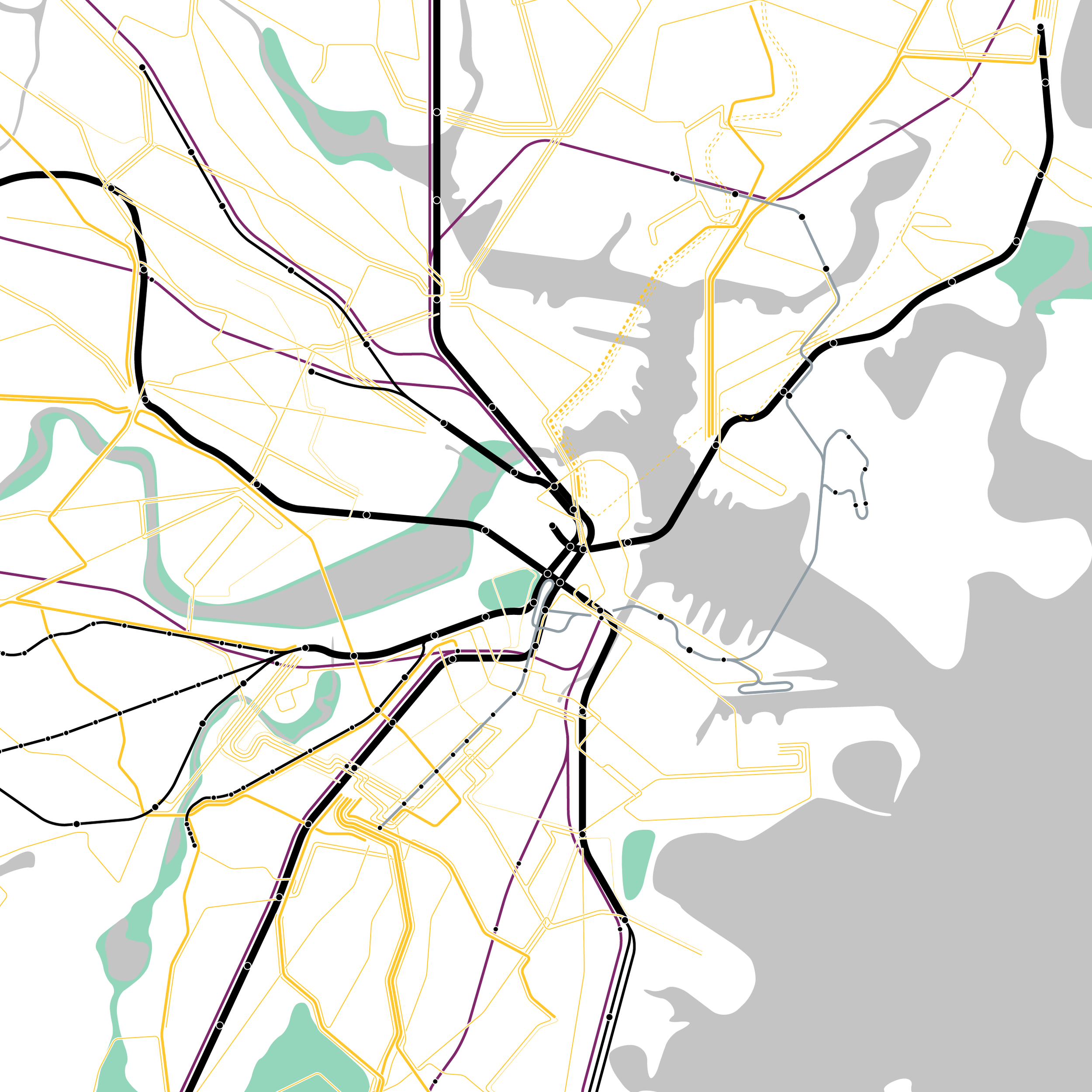
White Background, Color Subway
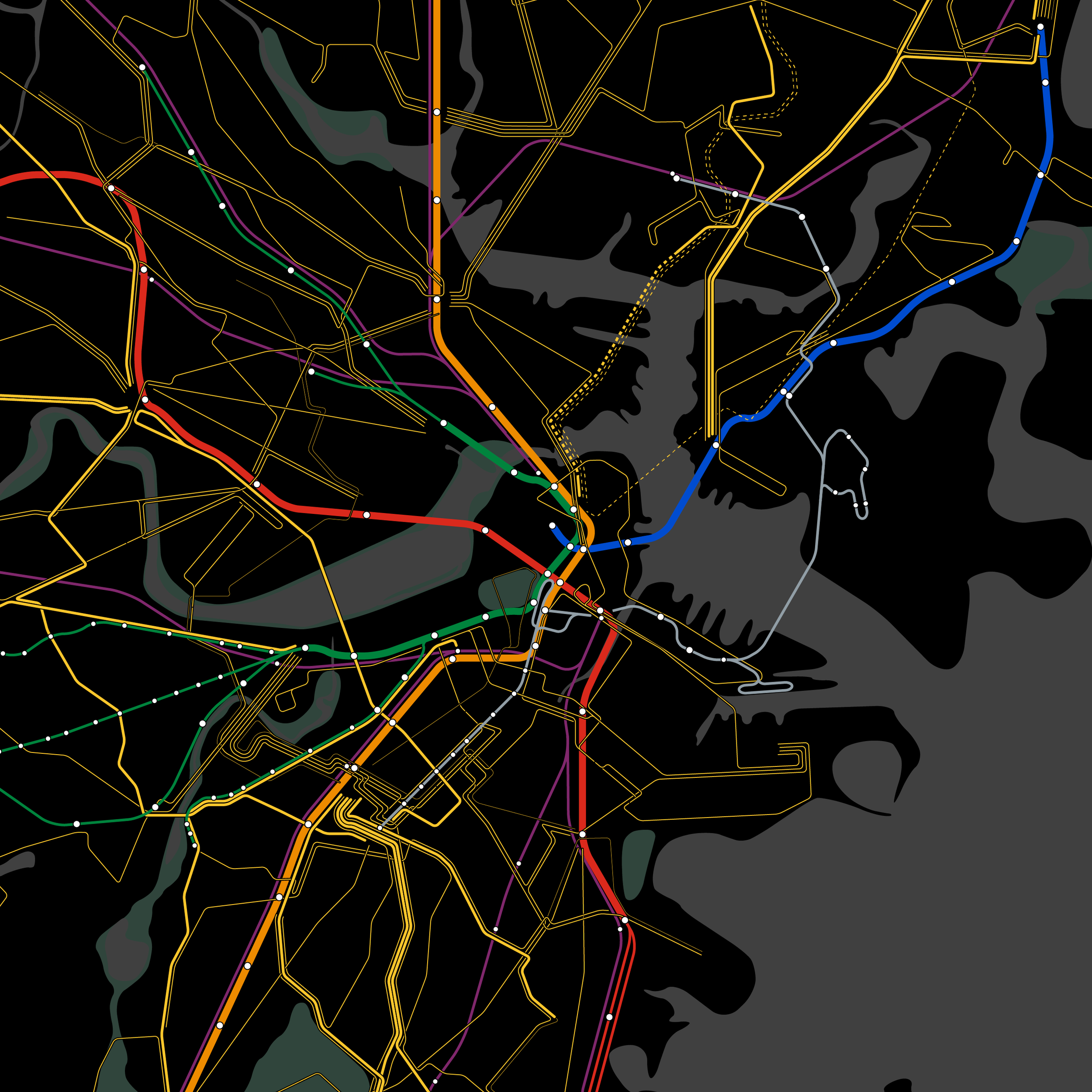
White Background, Black Subway
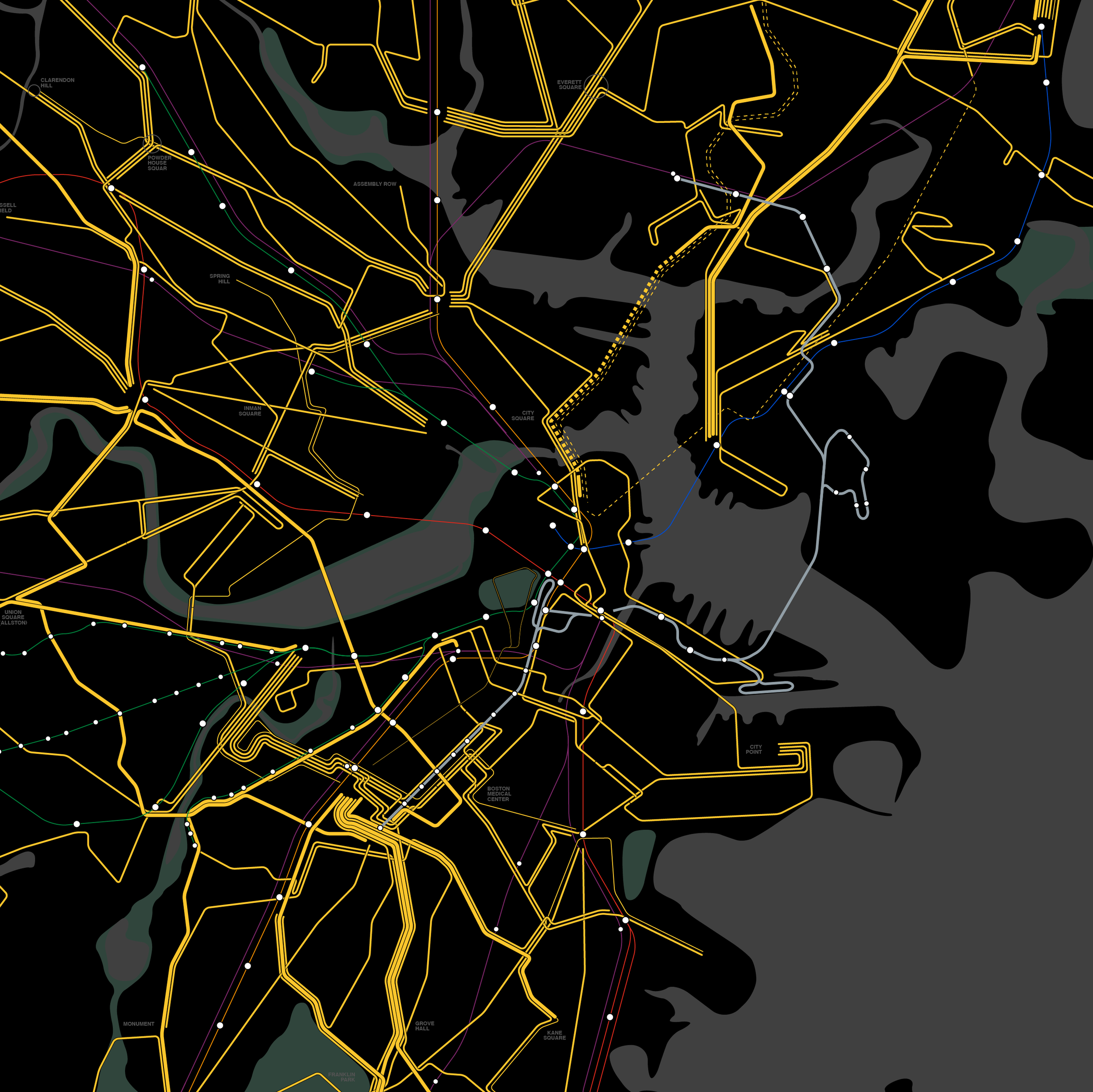
Black Background, White Subway

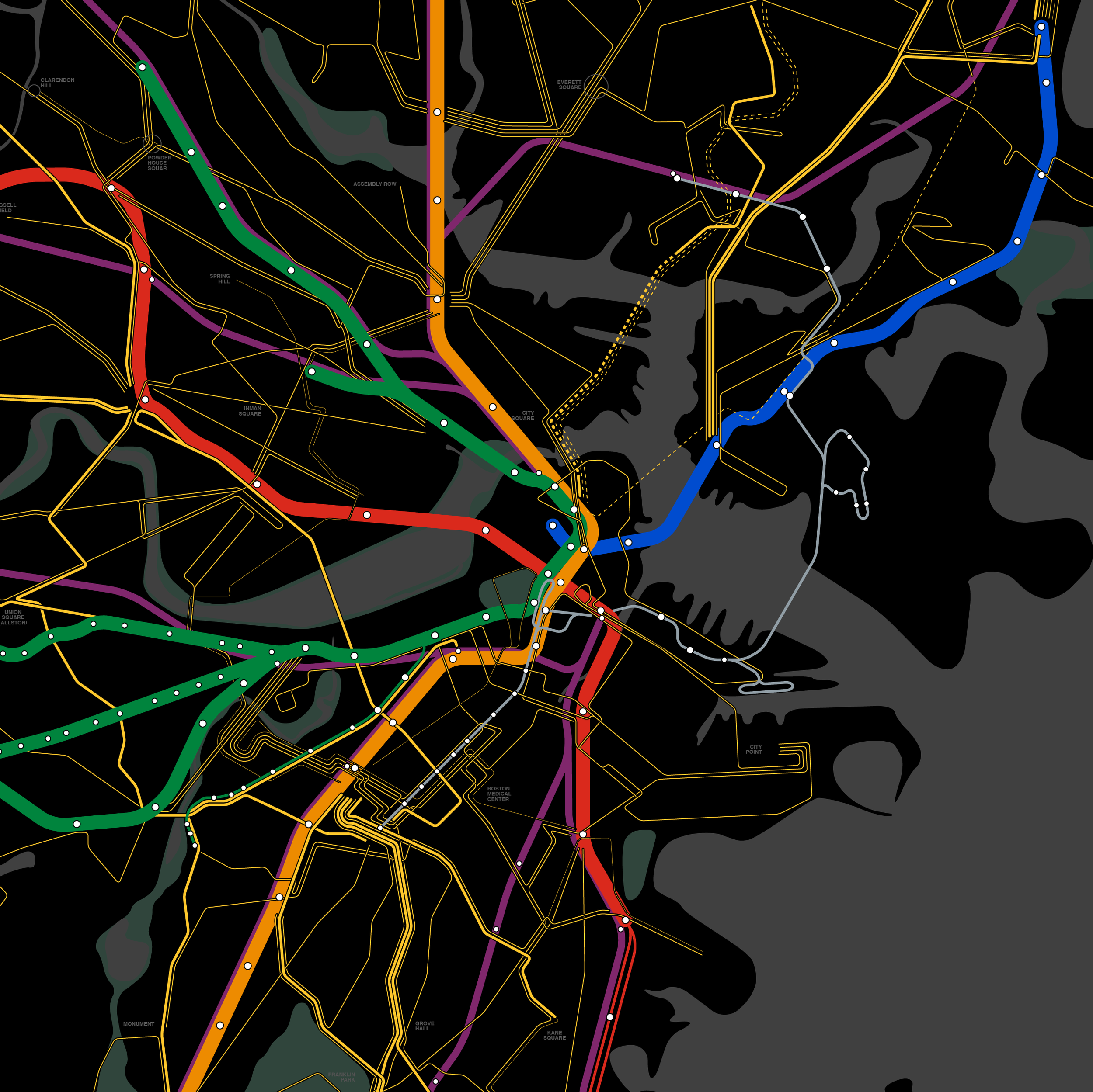
Black Background, Color Subway